Sticky Footer using Tailwind CSS
Published: October 3, 2019 Updated: October 5, 2019
I started experimenting with Tailwind CSS a couple of months ago and I’m loving it. The idea is to finally use Tailwind CSS on this website instead of Bulma.
Normally, I like to have my HTML page layout semantically divided into these sections; header, main and footer.
<body>
  <header>
    Navigation bar
  </header>
  <main>
    Page content
  </main>
  <footer>
    Social links
  </footer>
</body>
To keep the footer section at the bottom of the browser window, we need to add flexbox utility classes provided by Tailwind CSS like this.
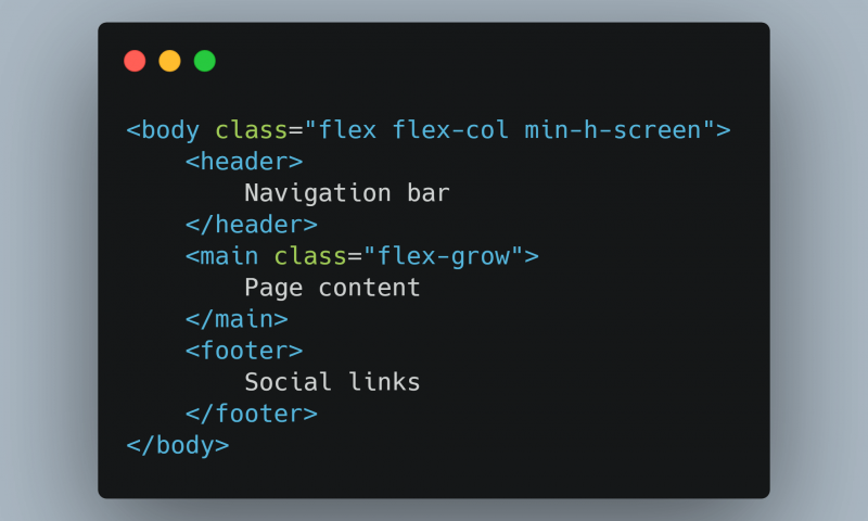
<body class="flex flex-col min-h-screen ">
  <header>
    Navigation bar
  </header>
  <main class="flex-grow">
    Page content
  </main>
  <footer>
    Social links
  </footer>
</body>
The Utility Classes
.flex
This sets the body element into a flex container. All direct children of the body element will become flex-items.
.flex-col
This defines the direction of the flex-items; header, main and footer.
We want the layout of the page to resemble a column where the flex-items are arranged from top to bottom.
By default, flexbox arranges flex-items horizontally in a row from left to right.
.min-h-screen
This class ensures the layout takes up the full height of the browser window.
.flex-grow
Adding this class to main makes it grow, occupying all the available space on the screen. The available space is equal to the size of the flex container, body, minus the sum of flex-items header and footer.
To stick the footer at the bottom using plain CSS and flexbox.
body {
  display: flex;
  min-height: 100vh;
  flex-direction: column;
}

main {
  flex: 1; /* Or flex-grow: 1;*/
}
View this implementation on Codepen